
This Tool Just Made Devs Love Their Designers
Day two. Second product. And Google Fonts never looked so good.

In my last post I covered how I built and launched my first product called PALETTE. I wrote about this building experience here.
Today, I’m onto the second product.
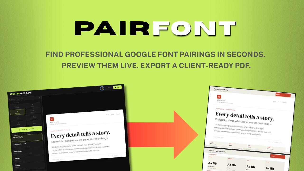
Meet PAIRFONT.
The first product opened my eyes into some of the output functions this HTML5 format offers. The use of pre-sets was a great solution for colour matching.
I figure what else could be something that takes advantage of pre-determined matching?
And what’s a pain point for me?
This should give me a product starting point, right?
It did!
Why build this type of tool?
Matching fonts is a pain-in-the-ass type of design step I often find myself having to put time into. Mostly, around content making. And for web and landing page design.
When if comes to working with development teams and designers there’s a common problem with fonts.
Designers like the new, and next trends to explore. This adds loads of interesting portfolio examples to their work.
Development then has to try to find, license, and manage fonts in the back end of the coding.
For me, I’ve seen great designs hampered by the use of licenable fonts. And one big risk plan I tend to advise on is - what if the browser can’t support the font?
The user experience is impacted if a website has to revert back to standard fonts.
However, Google does offer around 60 fonts that work in browsers for web and digital, that don’t need licenses to be purchased before a site goes live. And long-term, not using licenses then means the issue of future license costs is avoided for clients, and you.
But, with 60 fonts, is there a way I could set up a font matching tool. One that shows me a few pre-set choices I can click through to review. Maybe with a client, or designer. Then these can be given to the client for sign off.
Working out what the tool needs to do
Already, I’m thinking about what the tools needs to be doing.
Inputs: None, I can load all 60 font’s into the tool - as they rely on the Chrome browser. No big issues.
Functionality: Simple. Click to generate a random pairing. Offer presets by theme. I can ask Claude on it’s opinion based on best practice or common font tool features.
Output: PDF and maybe PNG. I might want to export and drop a PNG into my slide deck - if I’m presenting to clients. Or, I might want to generate a PDF that is self contained. So some features like a text box to add a client’s project name in would be good.
All in all, not a huge or complex set of user requirements. So I outputted a brief, and then asked Claude (free version) to give me other considerations, once it had reviewed what’s in the market, and what other tools might be missing.
Feedback from Claude
Here’s the first response feedback.
I’ll use a curated set of ~60 Google Fonts with known good pairings built in (the way type designers actually think about it — contrast of personality, weight and structure), plus the random spin will respect pairing rules so it never suggests two similar fonts together.
On the preview layout — I’m thinking a proper editorial mock showing all four roles in context: a headline, subheading, a short body paragraph, and an accent label. Like a real design system snapshot rather than just font names on a page. That makes the PDF genuinely useful to hand to a developer or printer.
I had to agree. I’d not consider how the parings might be laid out. But this worked well. Like those ‘Quick Brown Fox’ font cards used by hand font examples.
We pushed on for more specific details. I gave it a simple name so we could track the conversation (TYPESET).
Here’s TYPESET — Font Pairing Studio. Open in Chrome and it loads Google Fonts live from the CDN — no internet needed after that initial load.
What’s in it:
44 Google Fonts across all 6 categories — Serif, Sans-serif, Slab, Monospace, Display and Script/Handwritten. All free, all production-ready.
40 curated pairings built on real typographic contrast principles — a display heading rarely pairs with another display font, scripts pair with clean sans, slabs pair with serifs etc. The logic is baked in so random spins always produce something usable.
Mood filter — 8 moods (Elegant, Bold, Minimal, Friendly, Tech, Editorial, Retro, Luxury). Tick one before spinning and the pool narrows to pairings that match that personality.
Spin + 5 alternatives — hit spin and you get one main pairing applied instantly, plus 4 alternatives shown below as mini previews with their own font faces rendered. Click any to swap.
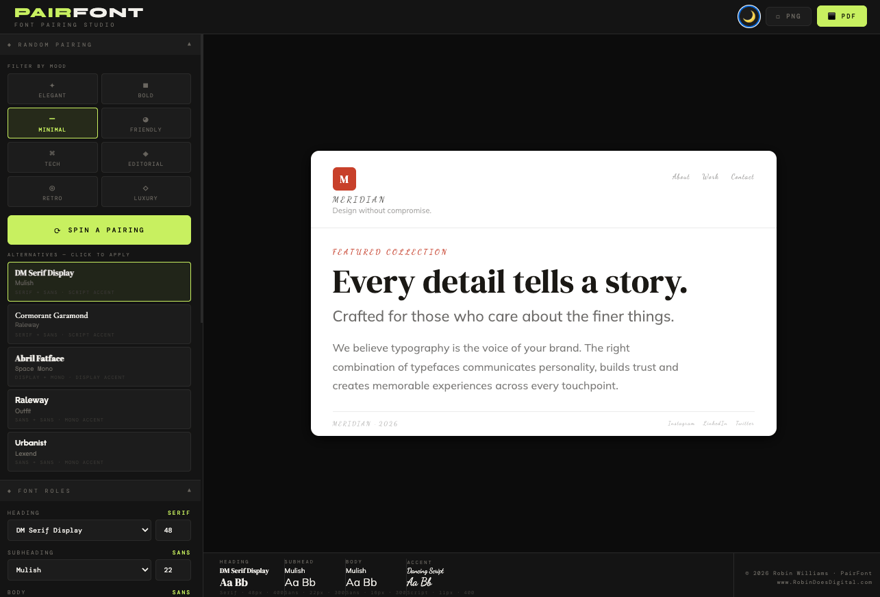
Brand identity mock — full mock showing logo mark, nav, accent label, headline, subheading, body copy and footer — all updating live as fonts change. Edit all the sample text in the sidebar to match a real project.
Font role controls — override any individual role (Heading, Subheading, Body, Accent) manually with size control. Mix and match beyond the curated pairings.
Specimen bar at the bottom shows all four roles simultaneously with Aa sample, category, size and weight.
PDF — landscape A4 type spec sheet with Aa specimens, full values, sample text, alphabet specimen row and footer credits.
PNG — pixel-perfect screenshot of the brand mock via html2canvas at 2x resolution.
Pairs naturally with PALETTE — the colour picker inputs in the sidebar let you drop in hex codes straight from a PALETTE session.
Good, together Claude and I have created some specific brief points. And we know how, and what needs to be in it.
UX wise, I’ll keep the same layout to PALETTE’s interface. This is logo top left. Options down the side. And main viewer on most of the page. Output options for clarity. Dark and Light mode toggle. So these tools feel connected.
Updating the name for user intent
Claude did a good job with the build. This layout worked nicely, and I tested it out. There were some iterations on UX and interface - which was to be expected. Took around 4-5 updates and builds to get this into a point I’m happy sharing with others as a tool.
But there was something bugging me about the name I’d initially chosen.
So I instructed Claude to review search terms for high-intent words that could be used in the tools’ name and headline - that would match expectations and need. Here’s what we reviewed.
High search volume terms:
“heading font” / “headline font” - same thing, both searched heavily
“body font” / “body text font” - universal
“subheading font” - common
“accent font” - searched by designers
“logo font” - very high intent, slightly different use case
The most useful set of options for a working designer is Heading, Subheading, Body, Accent. I figure that covers 95% of real design systems. Logo font is a different conversation (usually the same as heading).
So with this in mind, we renamed the tool to PAIRFONT. After checking there were no other’s on the market with that name, and tool option.
The final look
Here’s the dark mode version of what this build looks like.
And the light mode follows the PALETTE approach. And it something I tend to work with more.
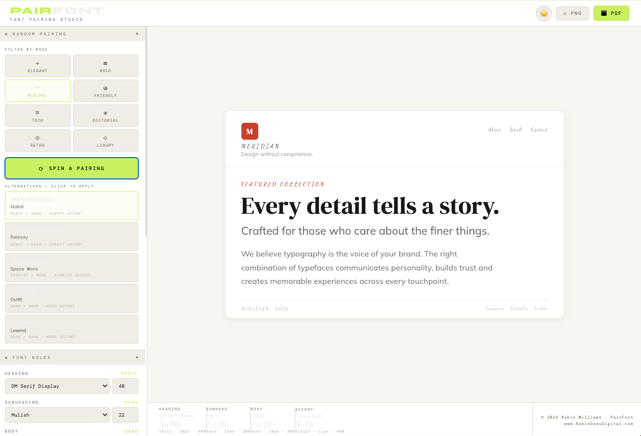
There’s load of useful tool with customisable options.
You can use a colour picker for your client’s project. Match the tone (maybe a colour found using PALETTE) and this changes the red tone default to whatever you pick.
The text for headline, sub and body, plus the red text about the headline are all editable. I think it’s more impressive for client work to pick the fonts based on their actual content. It’ll impress them more than default text, or the ‘Lorem ipso’ text many design tools still rely on.
This tool is designed to make client work easier. I wanted to give some customisation to it.
The output is where this gets better. We built a nice feature to make your developers love you as a designer.
Output of fonts and examples
The output PDF function follows the one in the first product. It’s easy to specify Claude to build a two-page PDF setup.
The first page is the viewer example. So you can see what you put in on the tool. There’s a quick reference to the main fonts and sizes.
The second page is there gives the Developer Spec. And most useful it that the PDF also has a CSS shortlink created. This allows a developer to copy and save the link. This can be pasted into the web stylesheet - and it’ll have the exact fonts, and sizes ready built.
Saving 15-30 mins depending on the project. This might now seem like a big time saving but for each time the tool is used to create the fonts, or set up tests - it’ll save your developers the manual time to find, copy and review these. Over time it adds up to a big cost saving. And if it’s seen to be ready made by the designer working with them it carries good favour! Which is important on web projects as nothing ever runs completely to plan.
And, if the clients want variations to consider, each set of fonts can use the tool to create a short link for the developer.
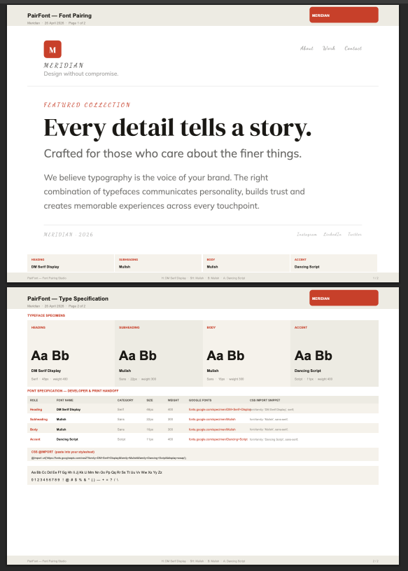
The PNG output option splits these two pages into separate PNGs. So you can add to a slide deck and make this seem like it’s been well put together - so saving layout time.
Wrapping up the build (and readying for launch)
I’m pleased with where the product is now. And it’s use and functionality. The output to PDF went surprisingly smoother than I expected. We’re using functionality outlined in the first product post. Most of the font ‘heavy lifting’ work is done because Google has a content delivery network (CDN) built into the browser. The tool only requires a first load - then it’ll work offline after that without any loss of access to fonts. The output to PDF works too. So no wifi connection is required.
I’ve got Claude to output a USER GUIDE into a Docx format, so I can review and edit this into a PDF to add to the product. It seems to be good at creating these - because it understands the layout and UX we’ve already discussed.
I’ve uploaded these files into Gumroad, as a product. And when this is live, I can share out to designers and dev friends - to get their feedback and reviews.
I think this makes such a lightweight tool really practical. And most importantly, it solves a real issue I have, and I know other’s have, when it comes to working with Font’s and design layouts for web projects.
I’ll keep the price low - to encourage uptake. Likely the £5-£9 range suits where I expect people to get this as part of their design toolkit. And as it’s a standalone tool - there’s no ongoing costs or subscription required for people to enjoy using it.
If you’re working with fonts in similar capacity, I’d love to know what you think if you get the tool.
This post is part of my 10-products in 10-days challenge. Where I used free AI to help code my product ideas. If you’re seeing this part-way through make sure you read the first post in this series - where I talk about why AI has me worried, and what I’m doing about it.