My first AI coded product is ...
Scratching my own it here, but I think other's will like it too.

My first product idea was born out of need. My need. And there’s nothing wrong with scratching your own itch when building a product, right? After all, if I need to solve a pain point I’m having - then it’s highly likely others will too.
At the weekend I had an issue. I’m working on a project. And my client needs to build out some guides that’ll be a free download for new subscribers. It’s the cookie content that’ll get people on their email list.
The approach is simple - and one I’ve done many times. Design something that looks good, and offers value. Make it free but put it behind an email sign up.
Problem is the have a basic logo. 2 colours. And no brand guidelines.
The guide needs more colour - so sections can be designed and the reader knows where they are. This is a start up, so brand kits isn’t in place yet.
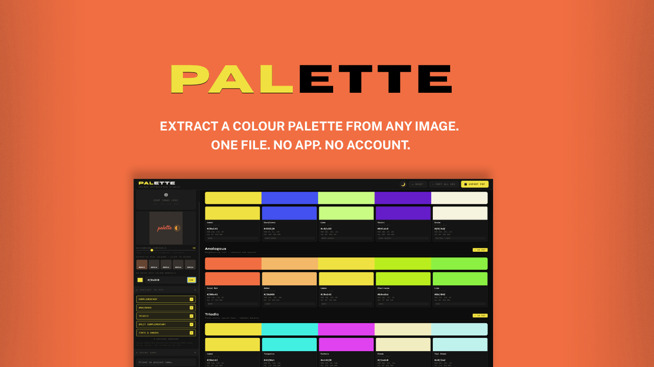
Enter my first product.
PALETTE.
Extract a colour palette from any image. One file. No app. No account. No Wifi.
Here’s what it’s built to do.
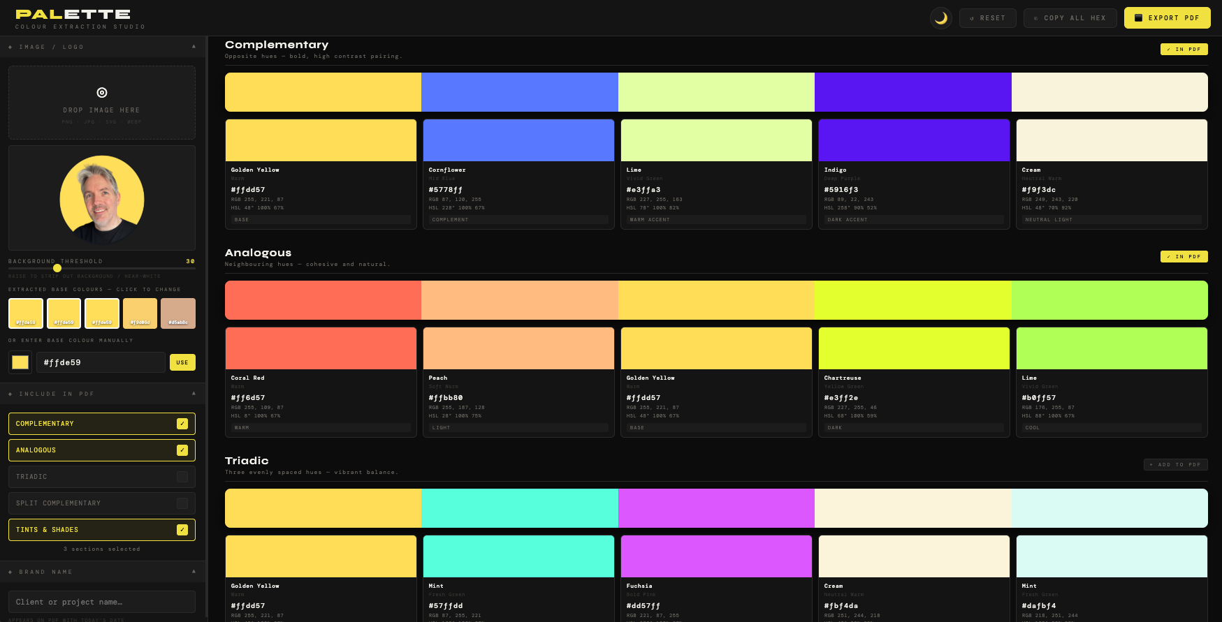
I drag any image or logo into the top right of the layout. And PALETTE will create a set of brand colours (complete with HEX codes and RGB mix details).
It does this automatically in groups of colours.
Complimentary colours
Analogous
Triadic
Split Complimentary
Tints and Shades
Now, I didn’t specify all these colours in my brief. I was just looking for complimentary ones.
But I asked claude what standard design tools might be offering and see if there’s a way to use these for ours. It pulled the others in. And, yep - I also had to go look up with Analogous and Triadic meant:
Analogous schemes = Harmony & Serenity tones.
Triadic colors = Vibrancy & Balance.
Why not just use online colour tools?
Now you could be thinking:
“Robin, why go to all that trouble of building a tool when there’s loads of free colour tools online!”
My reason is simple.
Ads.
Lots of Ads.
Free tools online are filled with ads as that’s the way the tools offer their services. I don’t want that. I wanted a tool that I can have in my toolkit. And just fires up - without searching or needing to be online.
Plus, I needed it now, and likely will for a couple of other projects I’m helping guide design on. So I briefed into Claude. And give it the strict instructions on our build challenge. And off it went doing it’s coding ‘thang’.
5 mins later I’m updated with a HTML file on the very first version.
The rough version.
Yes, the format and tool wasn’t too bad. I’d say it was just a little clunky. Claude had asked more questions before we built this first version. It asked about my layout, file formats and output options. I gave these answers in as much detail as I could. Then it build.
Even still - there was room for improvement. I tested the drag and drop feature, and the select file options. There was a dark theme it built wiht. But I’m not a big fan - so I asked for the next version to have an option toggle for dark and light themes.
I also needed more legibility in some of the text.
Claude added in a great function where - next to the PDF output button - there’s a copy HEX option. Clicking this means all the clour schemes I’ve selected (the ones shown the viewer) are all copied into my local memory.
I can then go into Figma or another tool - and paste the hex values. Where all the colours will show in the those tools in one go. Soooo much more useful than the free versions online - where you have to copy and paste many of the individual tones out yourself. A nice addition form Claude there to give it some dues.
The naming strategy I’m working with
I’d initially just called it Colour Picker. But during the back and forth conversaion I had with Claude I’d mentioned I was going to promote these tools to share with other people.
I wanted to pick a name that wasn’t already in use elsewhere - like another design tool. As there’s only going to be so many colour picker wordings to choose from before you step on another businesses name.
But I’m not a novice when it comes to marketing either. I figure that search intent words could be added into a product name - so that when a result shows with my tools it makes more sense as a solution to the seeker - that it’ll encourage a click through.
It’s something I’d have prompted a client to consider in their go-to-market strategy too. So I tasked claude with researching some high intent phrases. And PALETTE was the best option I found. It’s not being used elsewhere as a product name. And the sub heading lines I can generate from the name - and what it does - offer lots of strong marketing keywords that fit into search intent.
I think I’ll note this approach for the other products too.
Version control
It took a few more rounds of building - and I soon found I hit the wall with the free tier usage of Claude. I just waited patiently and moved on to other work in the meantime.
Before long I’d got a version I liked - and I contacted a couple of designer friends who I think would offer some honest feedback.
We arranged to speak in the coming days. But I have added in the feedback and the updates here - as it was a good steer to make this product better.
My friend Michelle is a designer - I worked with her back in Marketing. She’s US based and has had a long career employed and freelance in desing. I rate her thoughts. I ran through the tool on a Google Meeting. And she could see how it worked. Then I shared a version with her. She’s MAC based too - but I showed her how to open in Chrome - which most of us MAC users have anyhow.
Here’s her feedback:
ROBIN! This is so amazing!
I’m having fun using this. I had a logo to make so I snapped a shot of their existing web page to load in this tool. I found the perfect colors to use.
So far my only constructive feedback is to make the teeny tiny text full white rather than grey. They are hard to read...and even though a person will probably not need to look as they get used to the tool, in the beginning its helpful.
By the way, how does the program asign a name to the color? I found it interesting that the deep pink was called “mauve” and the gold hue was called “Earthy Yellow” ...lol, it really makes no difference, I was just curious.
The challenge with giving names to colours
Hmmm … great feedback from Michelle. And easy to check if Claude can update this for the next version.
I briefed Claude on the text update. And I asked about the colour naming. Which has some limitations in the design world, here’s why.
Currently, the ‘design and colour’ landscape looks like this:
CSS named colours = there’s 147 names (ones like cornflowerblue, darkslategray) - the only truly standardised list is defined by the W3C. But, they’re awkward for design use - and don’t cover most palette colours.
Pantone = the industry authority for print and brand colour, but proprietary. You can’t embed it.
RAL = used in industrial/architectural design. Not relevant here for this tool.
NCS (Natural Colour System) = used in Scandinavia and some design industries. Also proprietary.
Paint brand names (Farrow & Ball, Dulux, Benjamin Moore) = evocative and widely referenced by designers, but brand-specific and not standardised.
What my tool uses is a craft naming system = HSL range matching to human-readable names like “Warm Grey” or “Burgundy.” This is what almost every colour tool does (Coolors, Adobe Color, Canva’s palette tools). It’s defensible and useful, but it’s interpolation, not lookup. So building anything with colour names has to not use other proprietary names.
It’s something I need to bear in mind. And now I’m aware of - will need to be a consideration for other products I build. Much like the naming conventions I’m using.
I can add a reference to this (which is what I did) - just so there’s no issues when designers are using it.
Solving my own problem
The tool works. And like Michelle mentioned - it’s actually super easy to work with. I spun up the colour palette I needed in next to no time. And I used this for my client project without any issues. The optional colours allowed us to design more visual layout than the boring 2-colour logo I started with. And they also have a PDF document of branding colours for all 5 types of schemes to add to their marketing toolkit.
Job done.
Product is set up and I’ll continue to get more feedback and testimonials as time goes by. As a tool it’s proven it’s usefulness across a few other testers. And I’ve used it far more than I thought I would. It’s a great quick use tool.
Setting is a live product
For all the products I’m making I’ll be getting them set up to access through a platform called Gumroad. This platform offers creators a way to launch products for free or for a fee. But the great thing about this is that you can set up follow up emails, and for anyone getting your products through it - there’s a great update for future versions - as this automatically lets people know when the new version is uploaded. For me, if I change or build out the product further, I don’t have to chase up everyone who bought it - they’ll get the updates free and forever once the buy the product.
Promoting the products will be a future post I’ll share in more details. For PALETTE I’ve set up some designs that show it’s screenshots and benefits. And put this live on Gumroad - there’s a button below for your to check it out. It you’re a designer or know someone who it - you’ll love how easy it is to find colours for brands and from any image.
One of Michelles comments also highlighted that I’ll need to produce a user guide. As other people won’t have the same video call with me. The products pretty straightforward - but I think it’s good to provide the best user experience even though this tool is pretty cheap to purchase.
I worked with Claude to create a PDF user guide as a Docx first - so I could check and edit. Them I can output future versions with any updates we make.
Here’s the button for the product - let me know what you think in the comments below.
Now, it’s on to day 2’s product in my next post.